• Home
  • Games Design
  • Mobile Apps I
  • VFX
  • Advertising
  • CPA
  • Experiential
  • Mobile Apps II

Slider

Yasmin - 0325946 - BIMD AUG 2015

Layout Inspiration
Color and Font

Proposal: My app is a Outfit Of The Day(OOTD) app which is for consumers to know where the products are being bought from an instagram OOTD post. With this, once the user click on the link that directs it to the shop where it is bought, the user can see the nearest outlet and the price.
Bad Website Issues
Web Version
Mobile Version

In (8th September 2016)'s games design class, we had discussed on the storyline of our own game. For me, I had finalized on the theme which is desserts. The storyline needs a bit of tweaking because I would have to create a much more substantial reward in the end. I now have to create a reward, find inspirations and references of what I want my game to look like.

First Storyline

Theme: Desserts

Objective: A aspiring chef helper that needs to collect all the ingredients needed to make the perfect dessert.

Storyline: The aspiring chef is currently just a chef helper, and needs help to buy and collect ingredients as the one that this aspiring chef is under is an owner of the bakery. The owner of the bakery entered a competition and needs the chef helper to buy the ingredients since they just realized they didn't have enough ingredients. The chef helper is in a rush because the competition is on the next day. The chef needs your help to collect them in time. So in this case, the storyline is now about the chef helper (it's their job) to help find the ingredients because they're authentic ingredients where you can just find it at a nearby store. So the levels would be changed according to what sort of competition it is. There's simple recipes and harder recipes as it goes a level higher.

Target Audience: My targeted audience is girls aged 7-12. The simplicity of the gameplay would make it easy for them to understand and play the game. It can also be played for older kids if they'd liked.

Ideas for reward system: 
  • Difficulty: Easy
    • If they collect all the ingredients the happiness of the customers/judges is 100%. If it's not enough ingredients, it will be less than that. This can happen because if they jump or duck at the wrong time, they'll miss the ingredient.
  • Difficulty: Medium if it's side scrolling.
    • There is a timer where they need to collect all the ingredients. If they don't get all of it in time, they automatically loses.
  • Difficulty: A bit hard if it's endless run so this is if it's side scrolling.
    • There are several types of the same ingredient. They all have different points or something like XP, where the higher the number is, the better the dish is going to be and so the happier the customer is. For example, there are two or three types of butter, the butter with the most points is the premium butter and so in the end of the game, if the player successfully collect the premium butter, the better and delicious the dish, the happier the customer is. 
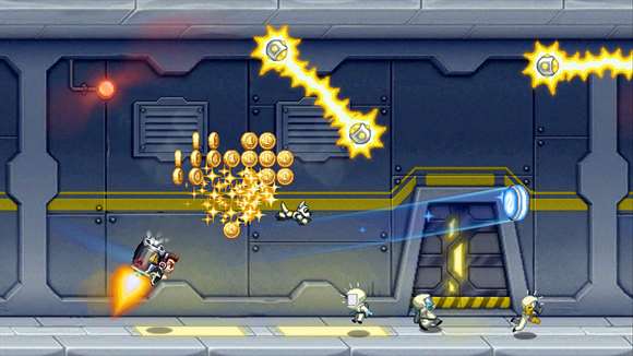
Character look & feel

Something like this, with round eyes and a chef apparel.

Alternative Storyline within the same theme
The chocolate chips have escaped towards the dessert making factory. It is up to Emily to go and chase after the chocolate chip cookies. But wait, there are obstacles such as gooey chocolate quicksand, and cookie shaper along the way that you would have to avoid.
_____________________________

Alternative Storyline 1 (in progress)

Theme: Galaxy; Alternate Universe

Objective: To help find Orion's lost star and become the hero of the galaxy.

Storyline: A character who wants to be heroic and to prove it he is gonna help search for one of Orion's stars. But there are others like him and are worried he might find the star first, so things get in his way.

Gameplay: Collect stardust but is stopped by quicksand or ...
_____________________________

Alternative Storyline 2 (in progress)

Theme: Nature

Objective: To chase after the creature and give back it's possessions and find out more about the creature and it's possessions.

Storyline:  In this universe, lives a lonely character on a journey. One day, while it was walking through the woods, it stumbled upon gem stones and decided to follow it. It then led to the most beautiful creature it had ever seen. As it was about to approach the creature, the creature ran away but it left something behind, its bag filled with its possessions (which consist of the pictures that character knows). As it wanted to know more,, the character went to go chase after the creature by following the gem stones that marks the trail.

Gameplay: Collect gems but there's obstacles like wooden logs and etc.


What I am putting
Storyboard

(From the notes) What I like to include in my video are these:
  1. Name, Age, Course
  2. Elaborate what my course teaches me
    • All the classes I took
  3. What I enjoy doing in the design spectrum
    • Video Editing
    • Color Grading
    • Coding (HTML, CSS)
    • PASTELS
  4. "All these are just what I'd like to do. If you want to know more check out this.."
Script:
Hi, I'm Yasmin. I am 19 years old and I am currently studying Multimedia Design, which means I learn ........ and many more. But, I enjoy most of my free time editing videos, color grading, coding and one thing you should know is that I love working with pastels. All these are just my work. If you like to know me better and see some of my other works, do find me here. Oohh would you look at that, I have to go now, I'll catch you later. Bye!

My reference video is like these two introduction videos, where it is a mix of illustrations, voice narrative, music and video.

https://www.youtube.com/watch?v=2qoIIa3B88c
https://www.youtube.com/watch?v=aspaCObUD4Y

I plan on trying to use any of these transitions from these videos
https://www.youtube.com/watch?v=RSsYMEyZCJM (0:19 - 0:30)
https://www.youtube.com/watch?v=4m9IQSpCNr0

Here is my moodboard:


Inspiration


Gif of my animation in class (9th September 2016) 
In class, I learned more on how the trim path works, and also a new effect called the venetian blind. We can use the trim path to make a trail or make it follow the path we created. We would just have to play around with the start and end keyframes, by offsetting it too, creates another effect. The venetian blinds is an effect that describes what it does. It basically creates the illusion of a venetian blind. We can play with the width of the stripes, the angles and etc. Other than that, he revisited on the topic of expressions, such as loop, ping pong, and wiggle. The wiggle expression can randomize anything.

Venetian blinds effect used on the word hi
These first 2 weeks, we had learned how to animate the texts which include enlarging them, offsetting the characters, played with the z position and etcetera.

The first week, I had learned how to offset the characters of the word, playing with the character of the word by rotating them around in 3D and how to easy ease the keyframes. Other than that, I changed the color of the text by making a drip effect momentarily and then going back to the original color. For that, I had learned how masking works. Mr. Kannan also taught us the shortcut keys including on how to snap the anchor point by holding the control key. By pressing y, is the shortcut key to move the anchor point. Other shortcut keys are similar to photoshop and other adobe softwares. One of the most useful one for me is cutting the timeline according to the marker which is by pressing alt + ] and alt + [ depending on which side we would like to cut. One other shortcut key I find useful is j and k, to go to the accurate point in a keyframe.

Here are some snapshots of what I did in class as an exercise:
Character Offset
Character Offset + Duplication with a different fill color
Rotation of Z positioning of 3D character
Masking with 'dripping' effect 
Final look
gif of the text animation
The second week, Mr. Kannan had taught us more about masking, about the graph editor and how we can change the speed of our keyframes, null objects (making circular rotation on the z-plane) repeaters, alphas, expressions, and how to animate text using by using the trim paths. After a few experimentations, I realized that the graph editor and easying ease the keyframes makes the transition smoother; by using repeaters, we can a make burst effect; the power of the track matte where you can reveal underneath the shape layer as it moves or hide the layer underneath it; ping pong effect and loops can be created by using expressions; by using trim paths, your text can be transition into the screen into a whole new level.

Here are some gifs of what we did in class:

rotation with a null object
more text-animations with track matte
gif of hello with trim path (press if it doesn't move)
 Note: The animation look choppy due to low frame rates

Things I have finalize last week was the target audience, which is for kids.

I have looked at several games and how their gameplay works. One that I had personally was inspired by and would like it to be my reference game is Jetpack Joyride, due to its simplicity.


For now, my theme is Aishah's bakery (not the title). I had settled on this idea after discussing and thinking about it more with my sister herself.

Storyline:  There is a pastry competition where the best chef who wins will get their own bakery. The pastry chef would have to create their perfect dessert. However, they would need to get the ingredients, to get them, the chef would have to run through obstacles while collecting the ingredients.

Gameplay: The player collects as much ingredients as they can or the number of ingredients needed for the chef, before the other pastry chefs gets it. Along the way they can collect coins to gain  The obstacles is that they will be icing sugar on the floor where the player would have to jump over it, if they run over it, they'll become slower (or lose points, TBD). But, if they collect lollipops, they will gain energy where they will boost their position amongst other bakers. There are one more obstacle which is if they are hit by cake batter, or cookie dough, they automatically lose.

My elements would consist of bakery ingredients such as butter, sugar, eggs and etc. I would want the style of my elements to be like the emojis on iOS like so:

Doughnut
ShortcakeBirthday CakeCookie


Color Palette: Sweet (maybe pastel)

Art Style*: Like Jetpack Joyride in terms of having outlines and clear fills. It'll probably be a flat design (where theres only a shadow and no highlights). I would probably want to implement emoji-like features into the game but I'll try to ruminate on this more.

*subject to change, still under process

"4th September 2016"

These notes were jotted and these ideas were brainstormed during the classes in Week 1.


Following is a written version of it.

Some of the themes and elements I had in mind were:

  • Aishah's (my sister's; could be anyone else's) Bakery 
  • Malaysian characters (they can choose and make their own character)
  • Castles, princess, medieval era and etc.
  • Tribal patterns; jungle theme; stranded on an island (something along the line of Moana)
  • Dystopian; buildings covered with vines;
  • Futuristic; Robotic 
  • Using Emojis
Target Audience: Kids aged 7-12

Instead of going broad with my search for bad websites, I decided to narrow down my research on the category of e-commerce fashion websites. Although mostly business are now run on instagrams, there are still blogspots that are still open for business. Even though the websites I haven’t chosen isn’t the worst website of all time, but this just proves that even if it is an established brand, there are areas of improvement for the site to be convenient and easy for the users. 

https://chloecloset.wordpress.com/

It is a website that sells clothes from other companies. Although the companies could be unknown they attract other users with a preview of how the clothes look like on people. What this website lacks is a convenient navigation menu where you can find different categories such as pants or t-shirts. This kind of website posts as they get new arrivals and doesn’t delete the posts of past sold out clothings. Especially using a blogger template, it makes it hard for the user to navigate through the types of clothes that are available on the current store. Other than that, to order the clothes you would have to comment or email them instead of putting in a cart like other stores. 

What they could improve on:
Instead of a blog format, they could change the layout into an organized layout where the top could have the header and the logo. The header could then be consisted of menus of the type of clothes they sell. Other than that, they could have a proper logo and set up a consistent theme for their website.


http://maqayla.com/

This is a well and recently established company of a Singapore clothing brand. This website although has the essentials of an e-commerce website such as the options the purchase the product, navigation menu in which categories of the product are available. What it lacks if it were to be compared to other e-commerce website is an account where the user can see their order history or possibly collect points. Other than that, the website itself is not compatible with mobiles nor is it sensitive to different browser sizes. The main header picture also needs to be fixed as the size exceeds the border. The position of the menu is located underneath the main header compared to how menus are located at the top most of the web page. 

What they could improve on:
Since it provides worldwide shipping to its customer, it would be convenient for their customers to see the price of the product in their own currency. Other than that, create a header with the logo of the brand along with its navigation menu. In terms of aesthetics of the product and consistency of the website, the photos of the product could have a consistent lighting, background and composition so that it can instill in the customers mind that it is a specific type of product. For the main page, instead of showing all the products, a preview of some of the products such as new arrivals would help simplify and a pleasing to the eye. The website could use a color palette, I realized that a pastel palette could help to create a brand for this brand. For a regular user, an add to cart button on the image itself could aid the process of buying the product. They could also add minimal amount of animations of to the website such as a simple transition ease in or out once the product is clicked on.

_________________________________________________________________________________

*Edit
Other bad websites that is not fashion e-commerce


UPS

This website is aligned weirdly on the left which distracts the user's eye. With so many texts on one page, the user finds it hard to navigate through the page especially with similar font sizes and style which leads to bad hierarchy. The font choice for the website could've resemble it's company's logo to remain a consistent theme for the company. The color scheme does not resemble the company's colors, nor is it complementary to it. This website is not mobile-friendly.

What they could improve on:
They could go for a minimalistic approach and also use the colors of the company or some of the colors to create a consistent feel and look for the company. The link could be simplified rather than placing it all on the front page, they could provide links within the links, like a drop down menu or with icons. The positioning of the content could be placed in the middle so that it will be more pleasing to the eye.

Popular Bookstore

The website was created for the purpose to showcase their books rather than having the option for their customers to buy it online. However, the design of the website lacks hierarchy. The font sizes are similar making the user confused to where to look. There is too many red colors which can hurt people's eye. The image of choice is poor. The two choices where you can see popular's choice of books links to the same page. They could simply combine both malay and english titles into one. I had thought when you click the malay version, it would go to the books in malay, but it did not. The menu bar has random colors which doesn't show cohesiveness of the website or the bookstore. This website is not mobile-friendly.

What they could improve on:
They can find a better color scheme. They can also replace their links with icons or maybe minimize the number of links because some of the links aren't necessary to the home page. The choices for the type of books the user wants to look for could be replace with consistent images, font size, color instead of a tab like it is now. Maybe they can make the width of the container that contains the content wider as it feels a bit too small and tight for the information they had wanted to put in.

Tourism Malaysia

This is the website for Malaysian's Tourism Corporate website. They have another website titled Official Website of Tourism Malaysia. This website is cater for business. Some people might actually mistake it for a website for tourist rather than for a corporate one. As you switch to the holiday one, the theme drastically changed. A consistency for both websites could help tell the users that it's under the same website. The website has a double navigation bar which are confusing to some people as it is a corporate website they shouldn't be that much options on one page. The website is inconsistent as you scroll through, it starts off with huge images that fill the browser and then news and events that are choppy and badly photographed images and then with icons that are simple and minimalistic. It seems that they are mixing multiple themes into one. 

What they could improve on:
A better color scheme to represent Malaysia. A consistent theme throughout the whole pages and other connecting and related websites such as malaysia.travel . They could also condense the links into icons if they are going for a minimalistic approach. Have a goal towards the website especially with the links, it's like a news website rather than a website to promote Malaysia. Naming the links and having business-like elements properly would definitely help users know that it's a business and partnership website rather than a travelling one.

Testing testing 123
Testing testing 123
Newer Posts Home

ABOUT AUTHOR

Yasmin Kamarudin
a year older on the 19th of May
Taylor's University BIMD
Malaysia

Blog Archive

  • ►  2017 (11)
    • ►  July (4)
    • ►  May (1)
    • ►  February (4)
    • ►  January (2)
  • ▼  2016 (41)
    • ►  December (7)
    • ►  November (22)
    • ▼  September (12)
      • Project 1 Proposal
      • Bad Website Redesign
      • Storyline Update
      • Self-promo video storyboard
      • Moodboard for self-promotion video
      • More Word Play (Week 2)
      • Word Play - Week 1 + Week 2
      • Idea Proposal - Week 2
      • Introduction & Idea Generation - Week 1
      • Week 1 - Bad Website Analysis
      • SFX
      • Test for Games
Powered by Blogger.

Copyright © 2015 Yasmin - 0325946 - BIMD AUG 2015. Designed by OddThemes